Hello everyone and welcome back! I hope you are all enjoying your day and waiting to read my new blog. Today, I will going in-depth wit the three magazine's I have chose and further into the details of their mastheads, coverlines, and table of contents. You will realize that I am going to analyze what the magazine's have to offer.
Masthead:
 |
| The masthead/title of Glamour Magazine is in a bold, blue font. It is located on top of the magazine, center with the use of Franklin Gothic Heavy font and a light blue shade in the background. |
 |
| The masthead/title of Elle Magazine is in a bold, red font. It is located on top of the magazine, center with the use of Didot font and a white background. |
The masthead/title of Essence Magazine is in a bold, pink font. It is located on top of the magazine, center with the use of Essence Sans font and a yellow and white background.
These three magazines are so well-known that they cover the letters from the magazine with the model since people already know the name.
Coverlines:
 |
| The Glamour Magazine was organize to all be in written in English with an additional six cover-lines. All the words are written in blue to emphasize the important information, black to make a difference in colors and match the shirt the model is wearing, and white for the least most important detail people have to read. They only added one model with a relaxed lifestyle which is acknowledge by the open demin jeans and the lose long sleeve shirt with her messy hair and happy smile. There most important information are all in capitals as the rest is in lower case and they have little designs, for instance, the hearts designs on the right side of the cover and the bottom left which added a little box with words in it. This cover is speaking about the new looks of people and trends which occur. |
 |
| The Elle Magazine is written all in English involving five cover-lines introducing the new string trends. There is only one model who is an artist which people know wearing a strong/ bold red color lipstick, organizing her face with seriousness to create more of an impact. It has an additional five cover-lines which have the red information as the most eye-catching which is the most important compare to the black tat backs up the detail to what the topic will be on. It is all written in capitals,but, the bright in the lower enter is lowercase. |
 |
| The Essence Magazine is written completely in English including six different cover-lines which is speaking about power. They only had one model, Michelle Obama, who was the the first lady of the first black president Barrack Obama. They have numerous variations of colors, such as, yellow for power which is the main topic, pink which also matched the dress she was wearing, and the usual black and white. They had he most important words in larger size than others and more clearer to visualized compare to the rest. |
Table of Contents:
 |
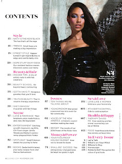
| The table of contents for Essence is split into eight departments which mentions the usual of what they speak about and then the new sections. It has a medium sized picture on the higher right of the cover which is a dark image with a fierce look from the model. As for the rest of the table of content it is organize in a simple easy way to read the information. The pink sorts it by the topic of the stories, as for the black font are the numbers and the additional information which are the details of each page. |
 |
| The Glamour magazine has eight different pages to find their table of contents. They have a great variety of colors scheme, as for the first opening one it was mostly red to empower the beginning and be an eye-catcher and the monthly headline as well. They have the number of the page usually on the right side of the page with a black font. They have numerous of different collages to emphasize all they are trying to mention or enhance. Also, Glamour has everything well sorted out with a good amount of white in the background to not make it look childish or a great amount of colors which develops people to get loss track. |
 |
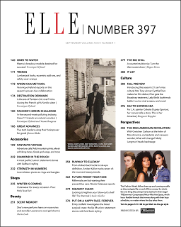
The Elle magazine has around six different departments with all the details and information in black. Their style is a little plain and basic but keeps it organize so that people are aware were to located what they are looking for. They have a center image which is plain black of a women as an another image which has color to have a comparison. They use their significant red color in the "L" of elle and has the number of the page right next to it.
|
Well that is all for today, thank you for reading Genre Research. I hope you have a wonderful day and make sure to remember that you are wonderful!


Comments
Post a Comment