Posts

Showing posts from December, 2020

Preliminary's PRODUCT

Image
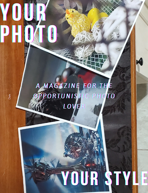
 Hi friends of mine, today is a beautiful day, I am about to get out of this jai... I mean, I am about to leave school and join this beautiful trip called; Winter Brake. But before that, I have to give you all the product of our work on this preliminary project of ours. With no more talking... are you ready? There you go, I do now have the pleasure to present to you my preliminary project for my magazine Your Photo. Your Style. For the Table of Contents, I decided on mixing up both of the examples I have shown you all on my previous blogs. To do so, I too the idea of putting the images on the right to put them at the left side along with a subtitle and subtle descriptions of what to expect from the pictures as the second example I had to show you did. I am really proud of how it looks and how I will make use of it. I hope you all like it too and with no more delay, I will let you go, be free, enjoy this break do you and enjoy other's company.  I hope you have some lovely holidays w

Preliminary Continuation Pt 3

Image
 Hello... humans? Today, I am going to show you what kind of fonds I have chosen to use for my table of content's print.  Now, I will be completely honest, I just scrolled through the many and many different types of fonts included within the canva's arsenal. As I did so, I picked only two and... I ABSOLUTELY love them. So much that I did not even look at other fonts. So let me show you which ones are them.  For the titles, subtitles, and numbers, I used the font League Spartan (size 23.8) and I used Montserrat Light (size 9.9) for the rest of the included print within the magazine.  The reason for picking these fonts is because I loved their simple yet elegant looks that fit my minimalistic desires for the magazine to look like. 

Preliminaries Continuation Pt. 2

Image
Ok, now that we are done with the cover page of our preliminary magazine, we are now ready to start our table of content. So... on today's blog, we are going to look at different designs for our table of content. The following designs you are going to see are the ones I am planning on basing my magazine's design... So, how am I going to do it? probably not the way you are thinking of. You will have to wait to see it in the final Preliminary blog... till then, have a good life :)

Preliminaries Continuation

Image
 Hello everybody!!! On today's blog, after some previously mentioned contingencies with our magazine, we are going to continue with our preliminary 'project.  As for today, let's focus on the way we want our cover page.  For it, I'd like for it to be really simplistic, minimalistic. This is because I want the entire focus of my audience to be in the cover-image rather than the title itself as many (if not all) magazines do. Specially Photography magazines.  For that same reason, after working on my creativity and prioritize my needs and wants rather than following standards, I came up with something like this...  The reason that leads to the creation of this design is my idea to keep the title to be perceived but not attractive by putting it in opposite corners. The same idea goes into the subtitle right in the middle but still not too aggressive on colors as they are smooth and friendly to the eye. 

Edit on Fonts

Image
Hello 'minasan'!!!! I think that is how you say 'everybody' in Japanese. Sorry if it is not like that, but you get my intentions (I hope). Anywho, let's get into today's blog. Today, we are going to focus on which fonts to use for our Preliminary project.  After trying many fonts and edits, and effects, I finally came up with the looks that I would like for it to have and so I came up with this while editing my design on  www.canva.com I hope you can see the different fonts I had used and tried in the left side of the screenshot. Those are the ones I had in mind but as you can see, I ended up using  Bebas Neue for the titles at the corners and I used Kite One for the subtitle in the middle. 

Bad News!

Image
 Hello everyone, on today's blog, I am going to explain how my whole magazine plan went downhill. As you all know (if you have read my previous blogs), I planned on including a feature of a talented photographer such as Kai Hornung and one of his many masterpieces. The feature that we actually got permission to use from himself was the one I planned on using as my cover page and the spotlight of the images I planned on including on my magazine but...  Yesterday, I talked about it with my teacher/supervisor and I was told that, according to the many Cambridge rules, I was not able to do it because any content included in my magazine had to be '100 % original'. Here is the proof of it and I must say that this is my own mistake, I had the idea that since my magazine was based on the idea of sharing people's images, there would be no problem with having the features but... I guess it is not. As for it, I have to now rebuild my front image's idea and style. But we are al

Contributors - Update -

Image
 Hi everyone, today, I have great news to share with you all! Are you ready? Drums, please!!! *Dramatic drums play* aannddd... I got a contributor for my magazine!!!!   So, as you may realize, the picture above is not from be, it is from our contributor/feature; Mr. Kai. Yes, THE Mr. Kai,  WINNER OF ‘THE INTERNATIONAL LANDSCAPE PHOTOGRAPH OF THE YEAR’ AWARD 2020. Yesterday, Mr. Kai responded to my messages saying that it is okay for me to use one of his pictures as a feature for my magazine, *hurray* and so, I chose the one above. Here is my proof  of him giving me permission to use his art for my magazine >  As you can see, I am a fanboy of this man's work, I admire, and respect him, so... excuse my cheese comments. Within the messages, as shown in the previous "Contributors" blog, I asked him for the feature, and he is now saying that there is no issue with it that he "would like to support" me in this project, not just that, but he also gave me the chance

Contributors???

Image
 Contributors!!! Contributors??? Ladies and gentlemen... we need them, and I will get them, or it. These past days, I started asking some of my favorite photographers about the idea of contributing to me by allowing my persona to use one of their pictures as part of a featured visual and or even story (if they are willing to answer some of my questions) as part of the content within my magazine which is conceptualized on sharing people's, or my own, pictures along with the stories behind it. Its composition. Or even tips that the photographer might want to share. The ending goal is to convey entertainment based on showing pictures and telling stories with it.  So, as said before, I plan on having a major feature in my magazine. I obviously want it to be something achievable and easy to make but just imagine. Like, just picture it, someone like Lizzie Peirce, Peter Mckinnon, or even (my favorite one) Kai Hornung. Like. Would you imagine having Kai Hornung featured in my magazine!!!?