Preliminaries Continuation
Hello everybody!!! On today's blog, after some previously mentioned contingencies with our magazine, we are going to continue with our preliminary 'project.
As for today, let's focus on the way we want our cover page.
For it, I'd like for it to be really simplistic, minimalistic. This is because I want the entire focus of my audience to be in the cover-image rather than the title itself as many (if not all) magazines do. Specially Photography magazines.
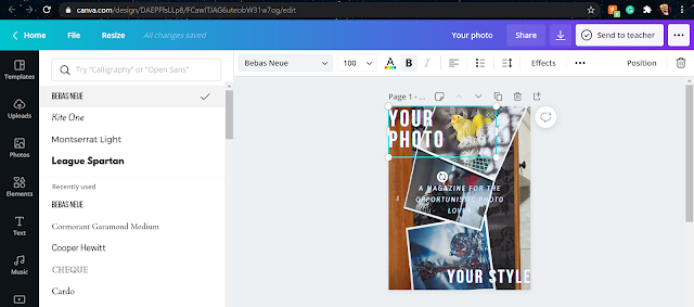
For that same reason, after working on my creativity and prioritize my needs and wants rather than following standards, I came up with something like this...

The reason that leads to the creation of this design is my idea to keep the title to be perceived but not attractive by putting it in opposite corners. The same idea goes into the subtitle right in the middle but still not too aggressive on colors as they are smooth and friendly to the eye.

Comments
Post a Comment