Preliminary Continuation Pt 3
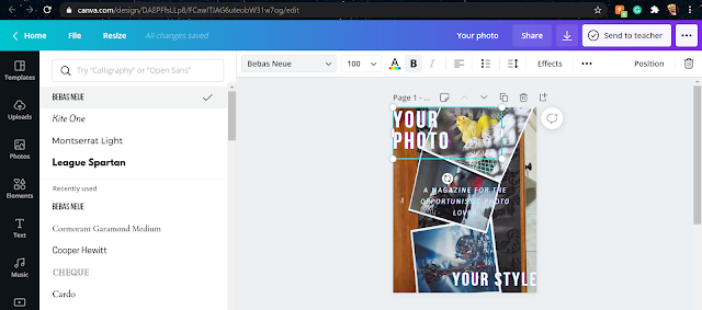
Hello... humans? Today, I am going to show you what kind of fonds I have chosen to use for my table of content's print.
Now, I will be completely honest, I just scrolled through the many and many different types of fonts included within the canva's arsenal. As I did so, I picked only two and... I ABSOLUTELY love them. So much that I did not even look at other fonts. So let me show you which ones are them.

For the titles, subtitles, and numbers, I used the font League Spartan (size 23.8) and I used Montserrat Light (size 9.9) for the rest of the included print within the magazine.
The reason for picking these fonts is because I loved their simple yet elegant looks that fit my minimalistic desires for the magazine to look like.

Comments
Post a Comment