Hello everyone!! Today, I am going to show you how my cover page is coming out as I am still developing and looking for different options on what to do with it after the occurrence of the contingency with my interviewee.
Using Composition Hi everybody!!! I am glad to have you around one more time. Today, we are going to explore some rules of composition with their meanings, and a quick review of their relevance within the picture. So let's begin with this picture I took quite a while ago. In the following picture, we have a great example showcasing the usage of the Rule of Thirds. T he R ule of T hirds "is a type of composition in which an image is divided evenly into thirds , both horizontally and vertically, and the subject of the image is placed at the intersection of those dividing lines, or along one of the lines itself." ( Rule of Thirds Definition - What is Rule of Thirds by SLR Lounge ) This is done so that the image's subjects could be 'seamlessly' placed at a natural position for the human eye. In this image, a feeling of nostalgia, solitude, and future hardships can be perceived but it is the contrasting colors of the yellow flower that give meaning...
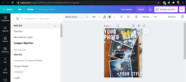
Hello 'minasan'!!!! I think that is how you say 'everybody' in Japanese. Sorry if it is not like that, but you get my intentions (I hope). Anywho, let's get into today's blog. Today, we are going to focus on which fonts to use for our Preliminary project. After trying many fonts and edits, and effects, I finally came up with the looks that I would like for it to have and so I came up with this while editing my design on www.canva.com I hope you can see the different fonts I had used and tried in the left side of the screenshot. Those are the ones I had in mind but as you can see, I ended up using Bebas Neue for the titles at the corners and I used Kite One for the subtitle in the middle.
Have you ever thought of a House Style being compared to a magazine before? Me neither, that is why we are here right now. If you come to think of them as one, a house style can be easily compared to a magazine, they both need a blueprint, a front and back face, a guide of its content, attractive colors, and they both have to be found useful or at least interesting according to the customer's desires and needs. So, from now on, I want you to think about "House Style" and "Magazine" as if they were one. That being said... From what I know, a house style is developed having the mentioned factors and many others like the budget, possible incomes, and expenses to be made. It is used in order to provide a place for the customer according to the different types of potential buyers. The different types of house styles are used to lure this variety or a specific type of purchaser which will or not be influenced depending on the type of blueprint (genre) of the house...


Comments
Post a Comment