Spread Pages - Planning -
Hello everyone! On today's blog, we are going to discuss a little bit about the idea I have about my two spread pages design.
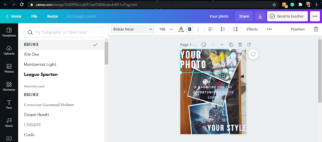
For it, I planned on making it simple, pleasing to the eye but catchy to the attention. For it, I did put some rectangles around my story's title along with little conjunctions of motivational sentences from the photographer himself as he said that it was what had inspired him to pursue such a hobby. Then, the text to the left is a piece of 'vague' information I have implemented in order to keep me on track for when doing the actual interview that at this point, I might have to do it fully online and therefore, have fewer amounts of evidence than those I have desired before.
For the picture, it is merely a found picture online with an added effect of glitch/blur by me that adds mystery and therefore could easily catch the attention of the readership.
When adding all of this up, this is the result;

Now, as established, this is a layout idea that to be honest, I might keep because I really liked how it came up. Some changes might come with the future, but I hope to keep the basics of it mentioned before with its minimal, catchy, and fancy features.
Needless to say that the production of such material was carried out using Canva.
I plan on doing a post for its creating process the following day.

Comments
Post a Comment