Posts

Double Page Spread - Final -
Image
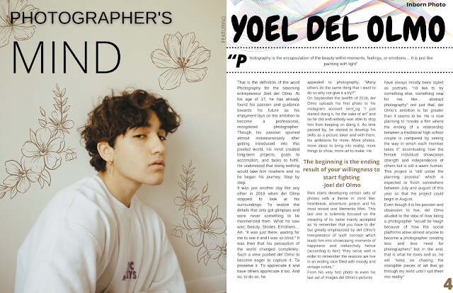
 Hello everyone, on today's blog, I am very glad to announce that the double-page spread section of my magazine Inborn Photo has finally met its ending result that I will show you in the following picture. For it, I used the Canva platform (the same one that I have been using for the rest of my magazine's creation). I resized it to a 17in by 11in's ratio which provides the dimensions of a double page. The setup of the double page is inspired by the following magazine's looks. For the image, I added the flower patterns as decoration hence I found the image to be too austere even though I wanted it to be minimalistic, I found it to look not pleasant. I then added the title/subtitle Photographer's Mind. On the left side rather than the right side as they did in the magazine's example. I also used the title's style on the right top side of the pages along with the three columns of text but differentiated it with a mini box in the middle of the columns in order t...
Feature Story

Image
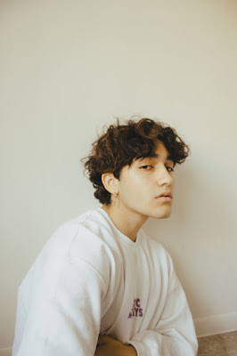
  The Birth of a Photographer   “Photography is the encapsulation of the beauty within moments, feelings, or emotions… It is just like painting with light” That is the definition of the word Photography for the blooming entrepreneur Joel del Olmo. At his age of 17, he has already found his passion and guidance towards his future as his enjoyment lays on the ambition to become a professional, recognized photographer. Though his passion spurred almost instantaneously after getting introduced into this pixeled world, his mind created long-term projects, goals to accomplish, and tasks to fulfill. He understood that doing nothing would take him nowhere and so he began his journey. Step by step. It was just another day like any other in 2018 when del Olmo stopped to look at his surroundings. To realize the details that only got glimpses and were never something to be mesmerized from. What he saw was; Beauty. Stories. Emotions… Art. “It was just there, waiting for me to see it ...

Final Cover Page

Image
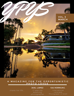
 Hi everyone! Today, after running some in-class surveys for choosing which of my cover pages to use. I finally got it. But first, I must show you all the ones I had created before showing the final product. So, first, this is how I had my cover page as shown before.  After showing this cover page to my teacher, I had some opinions from her and it made me rethink my cover page looks hence it did not appear to be so magazine-like. And so, this is what I came up with... this. I did not really like it because it was still lacking something like the Outdoor's Photography house style which has its masthead in plain view with the feature stories on the side. I also wanted it to have a simple style yet elegant like the one that the Outdoor Photography magazine has. This one did not have it and so, I started to produce my final draft that did then, turned in into my final product.  And so, I do hereby... present to you ladies and gentlemen, my final cover page. The reason I chose...

Cover Page - Developing -

Image
Hello everyone!! Today, I am going to show you how my cover page is coming out as I am still developing and looking for different options on what to do with it after the occurrence of the contingency with my interviewee.  

Spread Pages - Planning -

Image
  Hello everyone! On today's blog, we are going to discuss a little bit about the idea I have about my two spread pages design. For it, I planned on making it simple, pleasing to the eye but catchy to the attention. For it, I did put some rectangles around my story's title along with little conjunctions of motivational sentences from the photographer himself as he said that it was what had inspired him to pursue such a hobby. Then, the text to the left is a piece of 'vague' information I have implemented in order to keep me on track for when doing the actual interview that at this point, I might have to do it fully online and therefore, have fewer amounts of evidence than those I have desired before.  For the picture, it is merely a found picture online with an added effect of glitch/blur by me that adds mystery and therefore could easily catch the attention of the readership. When adding all of this up, this is the result;  Now, as established, this is a layout idea th...

Photoshoot updates

 Hello!! I hope you all are having a great day. On today's blog... I have some bad news.  The photo shoot I had planned for my cover page was not possible to be done this, nor last week hence my model has been set under quarantine and so, I do not intend to get near him in any future between his quarantine days. Such a stage will end on March the 10th, 2021.  So, my contingency plan will deal with this by now focusing on taking my other content's pictures and manage to do my content's page along with an online interview instead of an in-person one.

Media Research

Image
Hello! Humans, on today's blog, I am going to address the way in which media tends to showcase its main piece of recognition; their front page/cover. For Post Malone’s album cover ‘Stoney’, there is an overpowering tone of orange on his face. Orange symbolizes   enthusiasm, fascination, happiness, creativity, determination, attraction, success, encouragement, and stimulation. These factors are possibly what Post Malone inspired to achieve in his musical career which he informed Elderkin of. His tattoos are on display unlike the other images, this is because his tattoos are a large part of his music and character. His clothing is unique, and the patterns catch the audience’s attention. This is to differentiate himself from other artists. This is once again a midshot angle with shadows created on his face, indicating lighting that is more likely to be studio lighting than sunlight as the image has an orange tinge.